Connecting boxes with arrows
Arrows are the verbs. They’re what turn a set of nouns in columns into a logic chain. LogiMapper gives you four ways to make an arrow say more than “and then”: thickness, line style, colour, and a hover label.
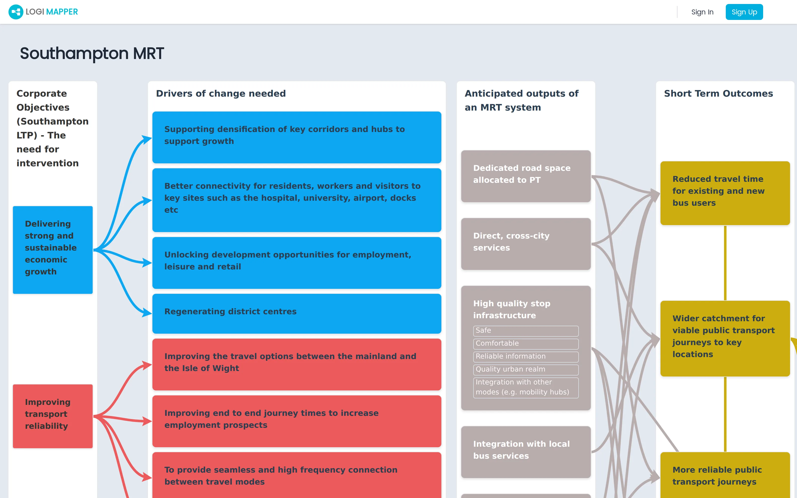
Drawing an arrow
Hover the edge of a source box. A connection point appears. Click the point, then click the destination box. The arrow snaps to the optimal edges automatically. You can connect boxes in any direction: forward, backward, within the same column, or across multiple columns.
Styling an arrow
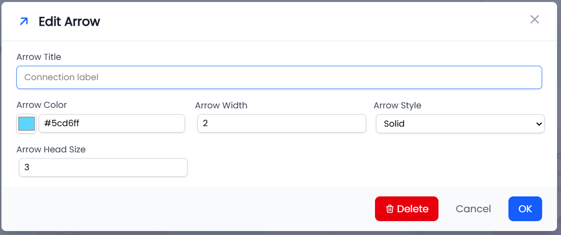
Click the arrow itself (the line) to open the arrow edit panel. From there:
- Thickness. Heavier lines feel like stronger relationships. Use them for high-confidence links from inputs to impacts; thinner for tentative or weaker links.
- Line style. Solid or dashed. A dashed line is a useful convention for “uncertain” or “conditional”.
- Colour. Useful for marking a class of relationship: red for negative effects, green for positive, your standard cyan for neutral causal links. Recently used colours are remembered.
- Label / hover text. Free text that appears when a viewer hovers the arrow. Use it for the meaning of the link, the strength of the relationship, or the evidence supporting it.
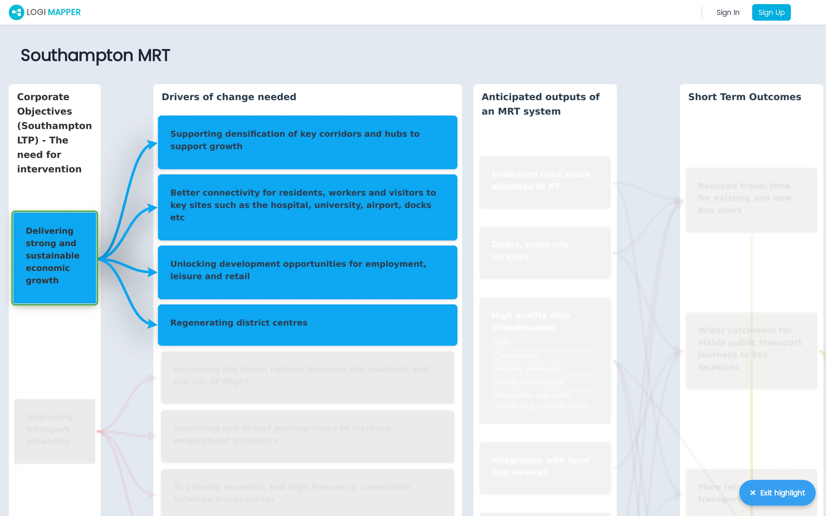
Highlighting chains
Click a box in view mode and LogiMapper fades the rest of the map, leaving only the boxes and arrows in that chain at full opacity. This is the killer feature of LogiMapper compared with a static diagram: viewers can follow individual chains through a complex map without the author having to redraw five smaller maps.
Click the same box again, or click empty space, to clear the highlight.
The legend
If you’re using arrow styles to encode meaning (red for negative, thick for high-confidence, dashed for uncertain), publish a legend on the map so viewers know how to read it. Open the legend modal from the toolbar and list each style and what it represents. The legend appears alongside the map for any viewer.